Friday, June 3, 2011

Knowing My Freak Factors

I have just completed reading David Rendall's Freak Factor: Discovering Uniqueness by Flaunting Weakness. A compelling heart-warmer that praises the faults that we think we have, the essay addressed various different key points to embrace your weaknesses, build your strengths, and flaunting your uniqueness. After completing the reading, I decided to assess these key points and figured out which ones I could relate to best. Much of what I read were things I had already heard, but, nevertheless, Rendall had made some good points. Here were my findings:

#5: Foundation Build On Your Strengths
I definitely agreed with Rendall's comment on building on your strengths. Particularly as a media student, I find it important to realize your strengths, continue improving them, and also capitalizing on them. Join groups! Become involved with your strengths! Let people know about your strengths! I can personally attest to building on my strengths as an artist. This year, I founded a non-profit organization in which I make graphics for people throughout the hip hop and music community. By developing this organization, I have built on my strengths as an artist, using Adobe Photoshop more than I ever had before, allowing me to get more skilled in the software. People have come to me to do their album covers, logos, and even concert posters over the past six months. By building on my strengths, I have allowed myself to be a go-to-guy on the campus for my artwork. I have been quite pleased by building on such strengths.


An album cover I made for hip hop artist Zack "IZ" Eisenfeld


A graphic I made paying homage to hip hop artist Lil B


#6 Focus: You Can't Do Both
Unlike his last point he made, I strongly disagree with Rendall's point on focusing and not being able to do "both." He discusses how much time and energy it takes to focus on one thing alone and building strengths within it. He even mentions that it is a fallacy to be well rounded and a fact to be mediocre in many things. All of this I disagree with. My director for the radio station I worked at said "If you're not able to do all that you're trying to do, you're sleeping too much." If you truly are dedicated, motivated, and have the drive, I feel that you CAN do both or more than both. Another part of my organization is that I have a radio station, make music videos, and promote artists' music. While I have not built on these strengths entirely, I still have put a great deal of energy with them and a great amount of time. If people aren't fulfilling all they want to, I believe they are sleeping too much.

#7 Find The Right Spot
This was another point that strongly agreed with. Rendall talks about finding the right spot to really channel your strengths and flaunting your weaknesses. He alludes to Rudolph the Red-Nosed reindeer, mentioning that Rudolph's flaw was turned into a strength once he worked for Santa, guiding his sleigh. Similarly, if we access places that can really nurture our talents (and even flaws), it may overall strengthen our creativity, self-esteem, and identity. For example, I am a member of Hip Hop Congress. However, I cannot rap, I cannot break dance, nor can I make beats or DJ. However, my strengths of being a good artist have been flaunted through my involvement in the organization and I have made posters and various logos for events that Hip Hop Congress had. By finding the right spot, I was able to exemplify my talents and let them be known amongst my peers.


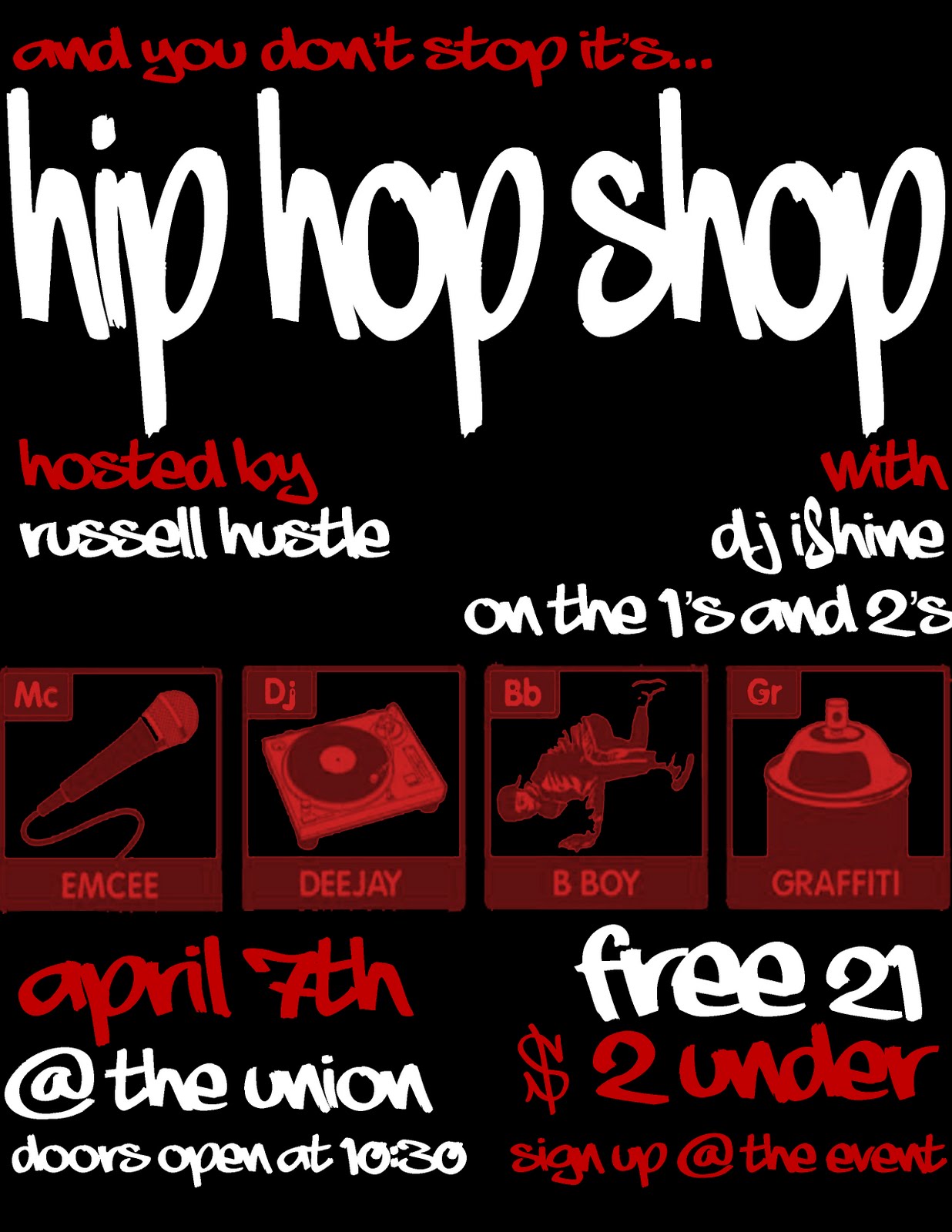
A flier for Hip Hop Shop I made


A flier for That's My B!+@# I made

Overall, the strengths and weaknesses I have had through "the creative process" were the same ones as I started with. I am skilled in the arts, and I try to spread my skills through various mediums, rather than keeping all my eggs in one basket. I found the creative process to be an enjoyable process, but I had not obtained any new strengths or weaknesses from the class. 

My Assesment of Collapsus

After watching, playing, and interacting with the media platform, Collapsus, I decided to critique it. Here is my assesment

Video Game Reflection: Dance or Die

As I reflect on my video game presentation, I do not see too many flaws with my group's presentation. I feel as if we let everything "come across" our audience as much as possible, all considering that we had to present for approximately fifteen minutes. I cannot find any points that did not come across to our class. However, I do feel as if we could have more creatively presented the material so that people were more familiar about our game.
The video game was called "Dance or Die," an interactive video game in which participants would fight/dance their way against their enemies, learning about the main character, Taylor's past (he is adopted by ballet dancers, but learns his real parents are mercenaries), and dancing/fighting to various songs.
As mentioned before, there were not any points, I felt, that did not get across to the audience. However, if we had presented more visuals to the game, people may have had a better understanding of the overall concept of the game. Also, perhaps if we elaborated more on the game play rather than the overall story of the game, people would also understand the game a lot better.
Other wise, everything else was easy. We had to discuss the varous concepts of the video game, including goals, mechanics, rules, and objectives. I felt that goals were in fact the easiest to explain because goals are considered player's intentions. The goal is up to the player, therefore it really was not up to us to tell the audience what the goal should be. We mentioned some possible goals, but ultimately, it was up to the players of the game to decide what their goals would be.
Overall, the video game assignment was fun and I thoroughly enjoyed coming up with a concept!

Tuesday, May 24, 2011

Critiquing Super Heroes/Villains

After finishing the Super Hero/ Villain project for class last week, I grew curious and decided to critique other's animations, based on their color, contrast and affinity, and tension and release. Here were my findings:

Tyler Dawley's "Sun Boy"
A fun and exciting breath of fresh air, Dawley's "Sun Boy" character was very original, funny, and creative. Sun Boy is a giant sun that shoots his rays of sunshine for everyone to enjoy the beautiful weather. Being that "it's always sunny where I [Sun Boy] go," one can infer that color is a big deal with Sun Boy, particularly with brightness. Sun Boy dons bright tints of yellow on his sunny costume/body. Much of it is kept in a steady and even saturation of yellow and maintains a solidarity uniform color. Obviously yellow, being Sun Boy's hue, indicates Sun Boy's bright, happy, and sunny personality. With contrast and affinity, we mostly see the contrast with the surrounding areas that Sun Boy arrives in. Most of the areas are dark, dismal, and even rainy until Sun Boy arrives on the scene and bursts the setting into an array of sunshine and happiness. Likewise, once Sun Boy makes his surrounding a happy place to be, he has created an affinity of joy and happiness for everyone else to experience. With tension and release, we see that much of the tension, as mentioned before, is with the dark, dismal, and unpleasant areas of the animation. However, the tension is released once Sun Boy comes into the scene and brightens up the day with his rays of sunshine. Sun Boy was both an intricate, inventive character as well as a lovable, enjoyable one. I anticipate his many other adventures soon!

Vincent Franks's Super Villain
A flawlessly EVIL super villain, Franks's villain lived up to all the correct stereotypes: vile, merciless, sneaky, scary, and violent! Vincent's unnamed villain captures the very essence of evil with his bright red light saber sword, hateful yellowed eyes, and expensive, but dark looking attire. Also following villainous tradition, Franks's villain donned deep hues of red and black colors in his expensive attire. This hue, as mentioned previously adds a dark perceptive to the character. The yellow of his sneaky, snake eyes make him appear to be an untruthful being. Also his odd alien-colored skin of pinkish-red make him appear other-worldly, and another reason to not be trusted. With saturation, we can see the villain's attire gets brighter in the middle (from black to grayish-black) because he wears a chest plate that shimmers in the light. This can also be applied with the brightness of the villain's costume because of the bright spots on his chest plate. With contrast and affinity within the animation, we can see how much more detail was used with the villain as opposed to the hero he fights (contrast). Nevertheless, both characters had the same build and even similar skill in fighting (affinity). Observing tension and release, the tension built when the hero almost got away from our antihero villain until the villain teleports in front of the hero and chops him to death with his red light saber. Vincent's super villain was creative, vicious, and among one of my favorites.

Capri Ciulla's "Biohazard"
Another original and personal favorite of mine, Capri Ciulla's villain Biohazard struck me as a completely original, innovative, and vile villain. Biohazard, like Vincent Frank's villain, captures the essence of evil with a mysterious veil around his eyes, pointy, painful looking juts coming out of his attire, and, his unsanitary appearance (including yellowed eyes, teeth, nails/claws, and disgusting scabs covering his body. Color was definitely a big influencing factor in the creation of this villain. As mentioned, his yellowed eyes, teeth, and nails show his unsanitary and evil intentions; his black and red costume shows that he does not represent the good guys; and his green and yellow gas of sickness escaping his hands represent that his super powers involve putting people in terrible health via his bio-terrorism (hue). The saturation on Biohazard can mostly be seen with the shades and tints of yellow throughout his body, each representing which part of his body he doesn't keep clean. His teeth are far much more yellow than his nails, and his eyes, not necessarily having anything to do with cleanliness as much as evilness, are the deepest yellow objects on his body. Similarly, with brightness, Biohazard's eyes illuminate the most on his body, making him appear more villainous than if they were not so yellow. Comparing the contrast and affinity within the animation, we see that Biohazard is far much bigger in build than his nemesis, the hero Night Nurse (contrast); and we see that both the super hero and villain deal with powers involving health and cleanliness (affinity). With tension and release, we fear the worst for the girl who is attacked by Biohazard (tension), but she is saved by the grace of Night Nurse who engulfs her in a protective force field, saving her from Biohazard's bio-hazardous waste. Capri's super villain was intricate, original, and also another favorite of mine.

If I Could Have Any Powers In The World...

After just listening to a radio segment from This American Life, I contemplated what super powers I would want. The following audio response to This American Life discusses that I wanted the same powers that super hero, Goku, from the television series Dragon Ball Z, had.


Goku, from Dragon Ball Z
  

Sunday, May 22, 2011

My Super Hero

Inspired by a few friends of mine, this is B-Girl. She is a combination of a ninja/ bionic woman. Her super power is the power of music. The lighting (or lack of it) represents her mystery, and she wears blue and purple because she's so chill and cool.


Also, here is the animation that goes with my super hero:

Thursday, May 19, 2011

Comparing and Contrasting "Hey There Harry" and "La Boite"

Nearly a week since my group and I finished recording two videos, I have decided to examine the similarities and differences between our films. Both based on the premise of one joke (S.H.I.T. vs T.G.I.F.), La Boite was a romantic comedy whereas Hey There Harry was a cowboy western picture. While both videos' most apparent differences were within their genres, I closer examined their other deeper, not-so-obvious similarities and differences within their productions.
One of the immediate similarities, for example, that I had noticed with the two films were their use of movement with the characters' walking. In La Boite, the mime used much of his walking to convey his mood. When he was depressed in the beginning, he walked slowly, head down, defeated. When in love, he walked in a goofy, jovial manner. Similarly, in Hey There Harry, the way each cowboy described their style and demeanor: Randall walked snobbishly, conceited, and almost in a swagger. Harry walked impatiently, angrily, and almost in a strut, and Caleb strolled in a heroic, confident manner.
Another similarity was found in the use of space in both films, though conveyed in different methods. The space between the cowboys in Hey There Harry, whether it was between Harry and Randall or Harry and Caleb, showed a tension of animosity, violence, and trouble. The trouble would ensue when Harry killed Randall and Caleb killed Harry. Less troublesome, the tension in La Boite had more to deal with the tension of love between the mime and his love interest. They sit extremely close together on the bench, but the mime struggles to get her attention, and struggles to earn her love.
Each film had their differences as well. One can immediately notice the differences in tension and release with both films. In La Boite the tension and release had more to deal with the mime's frustration to capture his love interest's attention and date her. In Hey There Harry the tension and release had more to deal with capturing the murderous Harry.
Also, the films had their differences in displaying text and subtext. Both La Boite and Hey There Harry demonstrated very basic text within the storyline of the films (get the girl in La Boite; get vengeance in Hey There Harry). However, the subtext had more complexities in Hey There Harry. Things such as the jealous Harry having his wife taken away from him by Randall, his alcohol problems (Randall tells Harry all he does is waste his life drinking at the bar), and the Mayor's relationship with Randall (which gave him all the praise that made Harry jealous) are all things thatthe audience had to piece together throughout the film.
Nevertheless, both films displayed fine production work, from the writing, to the physical production, and the post production! Kudos to both Hey There Harry and La Boite!